Designing Mobile Websites
If you have reached this page you are probably an amateur webmaster wondering how to keep up with the changing world (I distinguish between amateur and professional webmasters on the next page). If you are a professional you are unlikely to find anything you do not already know.
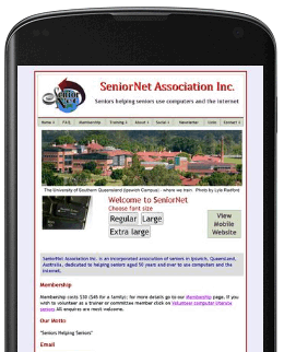
Google have altered their search system to favour smartphone-friendly websites if a search is conducted from a smartphone – see Google’s webpage for details. Initially this did not seem to be of concern – members use computers and tablets, typically, to look at my websites, and my SeniorNet website is on the first page of any search for seniors’ computer training in Ipswich. BUT potential members can be garnered via smartphones in the hands of the children/grandchildren of those potential members. So something had to be done. The images below link to my two websites to see what I decided to do. (Note - I have more to say below this group of images).
| Mobile Site | Mobile Phone Views | Full Site |
 |
 |
|
 |
 |
The rest of this sub-site covers the following topics:
- Design Philosophy - various approaches to the design of websites to meet Google's parameters, and the advantages and disadvantages of each approach
- Design Application - suggestions as to how to build pages for the mobile site
- Detection - how to determine that the client is using a mobile phone - this is far simpler than it appears to be.
- Linking - handling a call back to the full website if the client does not find what they require on the mobile site - this turned out to have a succession of 'Catch 22s' and was far harder than it appears to be. I had to develop a couple of extra tools to diagnose what actually occurred.
- JavaScript - the actual code to achieve the previous two dot points
- Tips for webmasters - a collection of the lessons I have learned over the course of my development.
